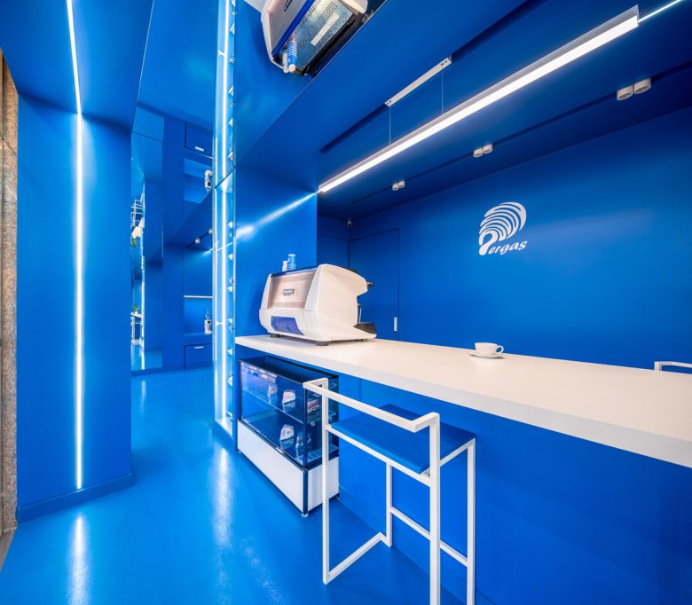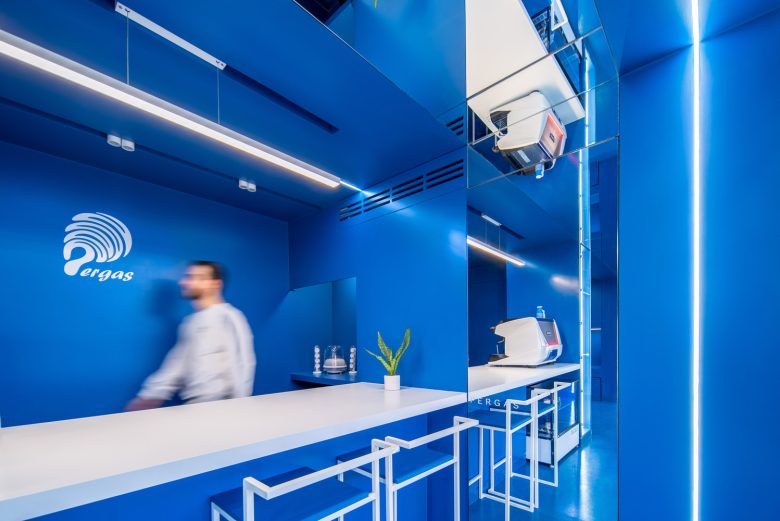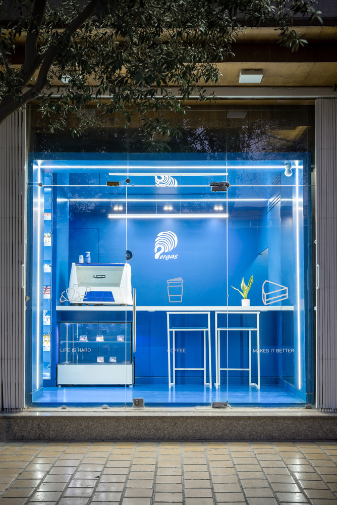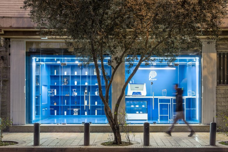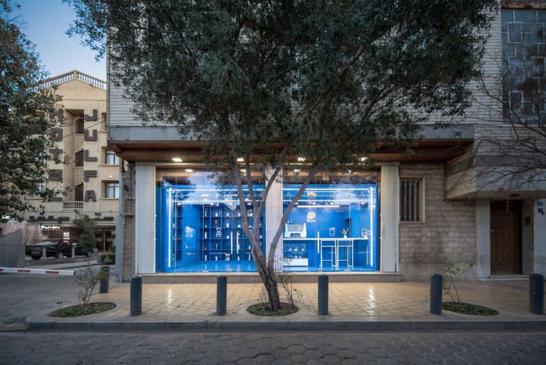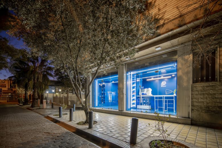
Pergas Cafe is located in the busy Armenian neighborhood of Jolfa, Isfahan, and the location of the property has its potential. The presence of a parking lot on the eastern side and the neighborhood with Jolfa Hotel and Church Vank is an opportunity to revive a small 36-meter shop located in one of the most important urban plazas of Isfahan.
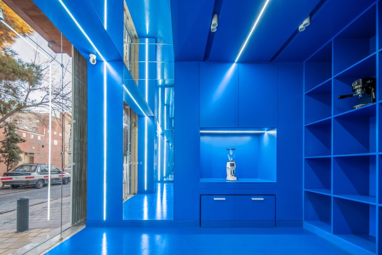
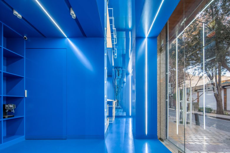
Although we are usually faced with a specific spatial typology in cafes and restaurants. They are located on the edge of the main street, all their windows are closed, and they contain a service space, and they serve customers through only one window. One of our main concerns in this project is to change the cafe window and create an expectation to remove the boundary between the inside and outside space, organize the sales and cafe space, and move the service department and warehouse to the back.
Other issues in the design of this project were divided into several main categories:
– Preservation of all the previous walls of the property (wooden decorations) without the least interference.
– Limiting the time that the employer had a shop for high rent (maximum one month) and the possibility of operating the project during Christmas, which is the main sales peak in that neighborhood.
– The small size of the property and, at the same time, the number of small spaces needed (cafe, store, warehouse, kitchen, etc.)
– Creating a competitive advantage in a neighborhood known for its many cafes.
With these descriptions, the main question of the design team was how the project could be placed in a part of the urban space (urban plaza) while solving the mentioned concerns. By creating visual continuity in the urban body, a distinction in the structure of typology and morphology of the urban bed is created, and passers-by are invited to its inner space.
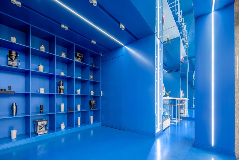
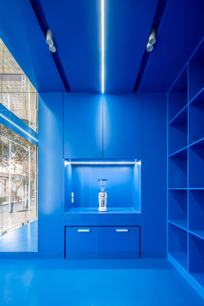
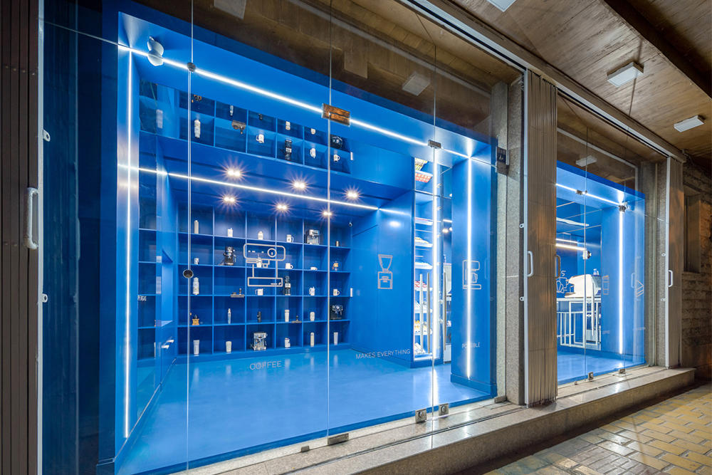
Therefore, we decided to design a box that would install new partitions with minimal interference to the existing partitions. At the same time, it allowed us to use the micro-spaces and the service sector as much as possible with the intermediate spaces it provided.
Due to the existence of two main sections (store and cafe), we also created the existing box in two sections, which, while having different uses, were unified by the same color and one hand mirror. The presence of mirrors in the body and ceiling was designed not only for the coherence of the space but also to create a new dimension. Also, the presence of this element in business spaces plays a significant role in advertising and attracting customers.
Architects: SAD Office & AMA Studio
Lead Architects: SAD Office & AMA Studio
Design Team: ALi SadeghGoli, Ali Shafigh
Photographs: Mohammad Soroosh Jooshesh COMO photography studio
Via
