NT Studio designed the Tripledot Studios offices with ample workspace and bold colors in Barcelona, Spain. Tripledot offices is a project of integral reform and interior design. Located on Av. Diagonal in Barcelona, these new offices have a surface area of 1,000 m2. The building where they are housed has BREEAM sustainability certification, so all the installations have been centralized in the general control system.
At NT studio we approach the project in an integral way, understanding that content and container are a unit. As interior designers, we believe that all the elements — structural, aesthetic and functional — that intervene in the space must always coexist in harmony. For this reason, from the initial phase we study the floor plan; we analyse and define the distribution in accordance with its use and functionality; we select the materials that will provide the most appropriate technical solution and we propose the furniture and lighting pieces, specifying all their finishes, so that the combination of the whole generates that unique atmosphere that we are always looking for.
The project has been worked on under two premises. The first: to create an attractive workspace at the service of comfort in order to attract and retain the talent of programmers and designers. The second: to design a workspace that seduces a generation that, after the pandemic, is reluctant to return to the office because it has become accustomed to the comfort of teleworking.
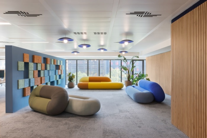
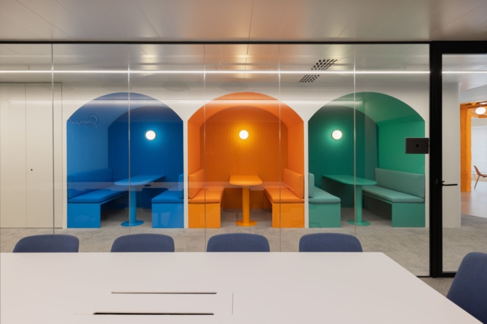
The colours of the logo – blue, orange and green – were the source of inspiration when defining the chromatic range for the refurbishment of these offices, helping to delimit spaces, create atmospheres and choose finishes and upholstery to generate cohesion in the overall project.
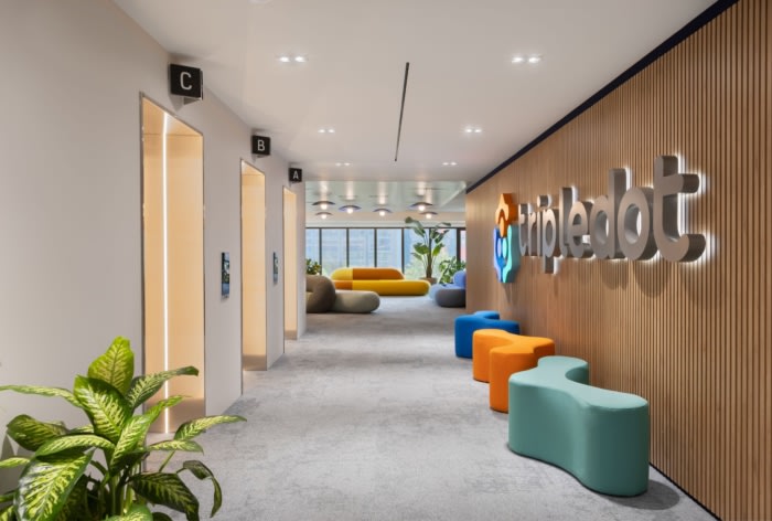
Located on the sixth floor, we designed the layout to create three distinct areas: the entrance – reception area, the operational area and the office – lounge area, maintaining the open space at all times, without visual partitions, connecting the different areas by means of fluid routes throughout the floor plan.
ENTRANCE – RECEPTION AREA
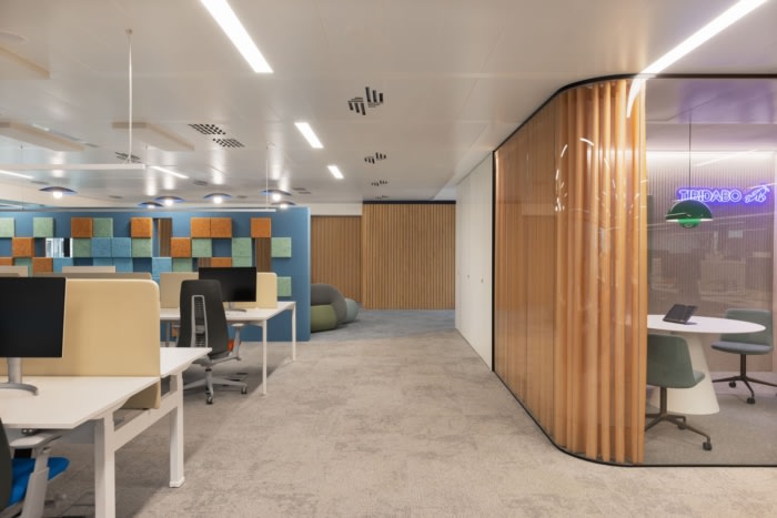
A bespoke separator made acoustic panels divides the entrance area and the operational area, thus improving the sound quality of both spaces.
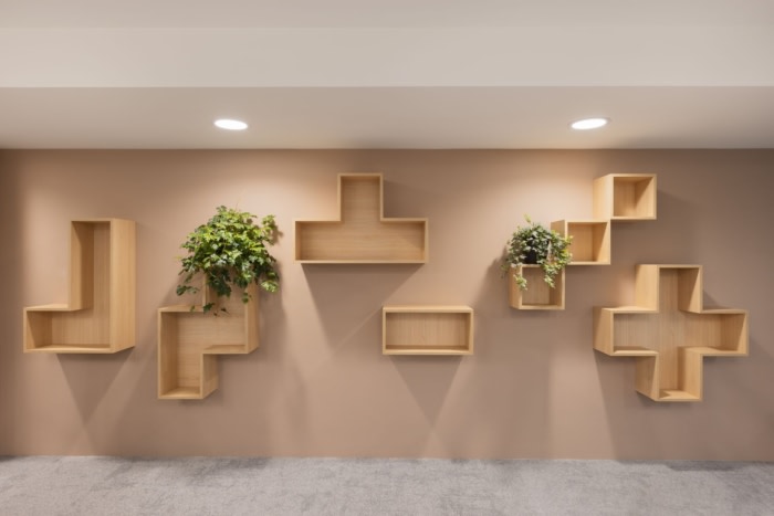
For the same purpose, we clad the wall that runs the length of the office with acoustic panels made of wooden slats. A solution that, in addition to its acoustic function, allowed us to conceal the bathrooms, machine rooms and storage cupboards, giving the space warmth thanks to the aesthetic and functional characteristics of the material.
The fire protection systems have also been concealed by bespoke cabinets. With this solution we managed to eliminate the prominence of an indispensable element minimising the visual noise generated by this emergency equipment.
OPERATIONAL AREA
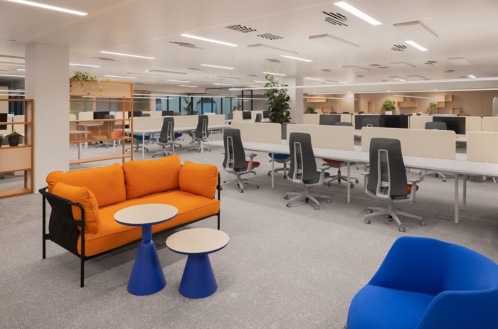
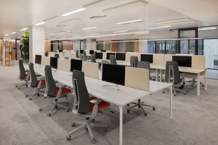
It has a total of 88 work tables combining fixed and lifting models. Suspended linear lighting is complemented by recessed ceiling-mounted luminaires.
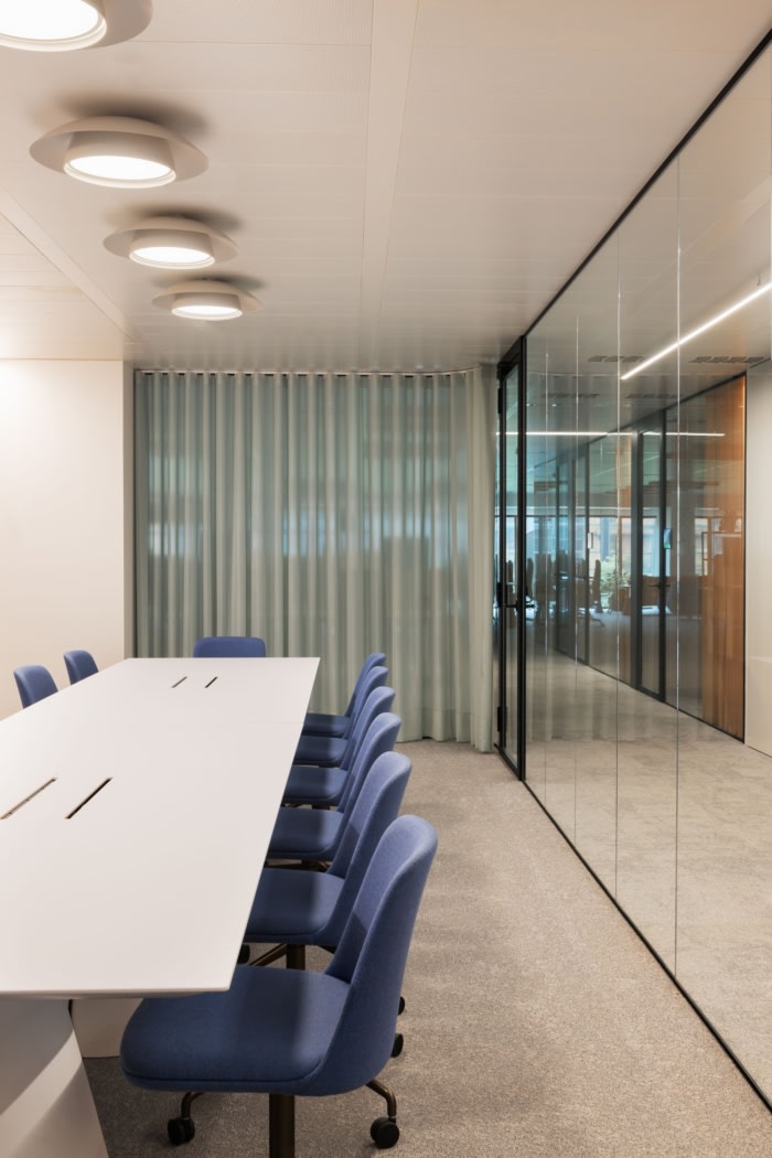
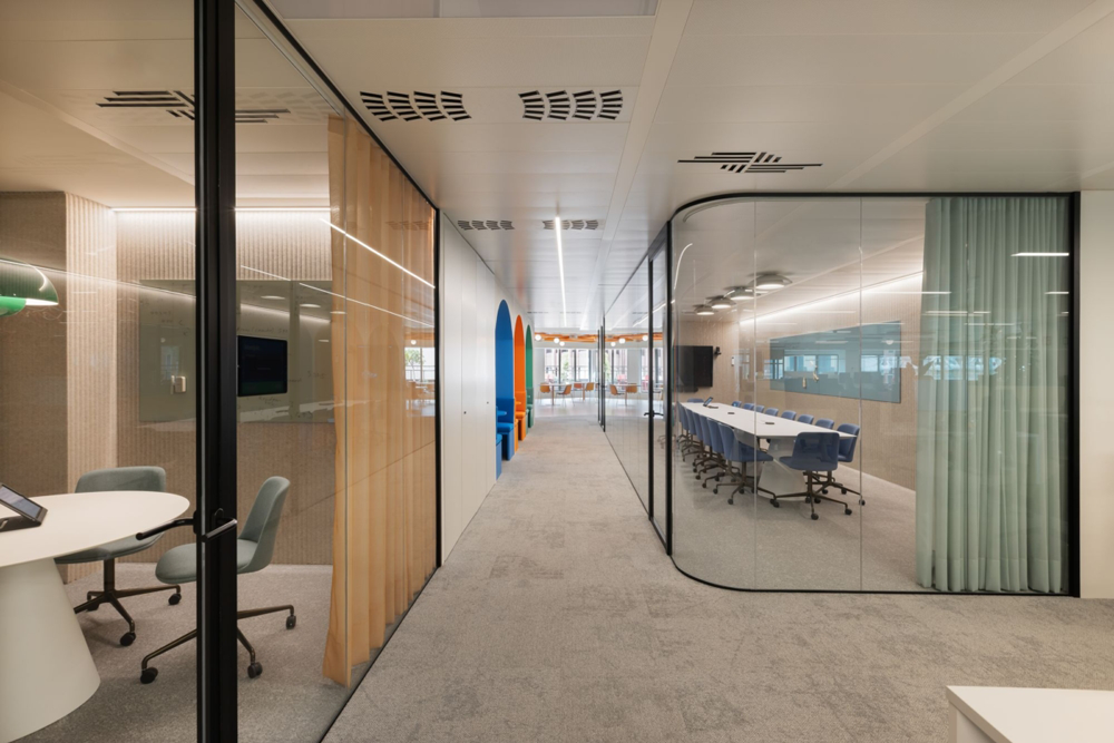
The meeting rooms and management offices are visually integrated into the space as they are built with glass partitions that stand out for their flowing curves. To increase their privacy, each of them has acoustic curtains in different colours.
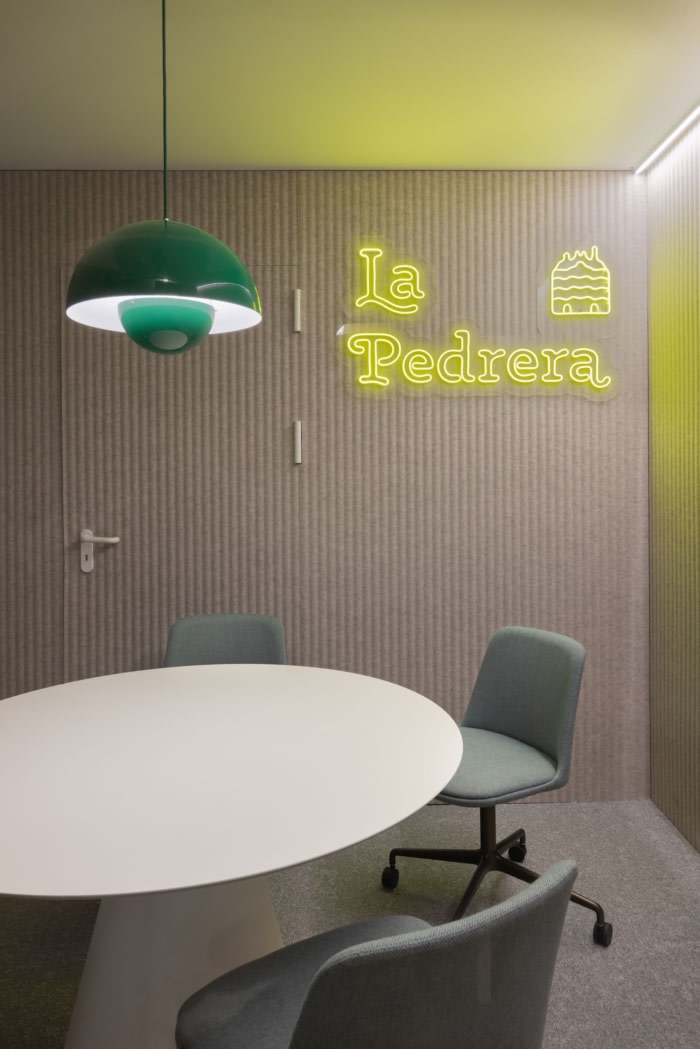
The different rooms are named after an emblematic place in the city of Barcelona and are identified by neon logos with the allegorical silhouette and the name of the building.
In the corridor that connects the operational area and the office – lounge area, we designed three vaulted spaces to work individually or in small groups that do not require great privacy. The main challenge in these spaces was to find the right tonality between the furniture and the different materials so the combination of all of them was balanced while generating a monochromatic atmosphere of great beauty and visual impact.
OFFICE-LOUNGE AREA
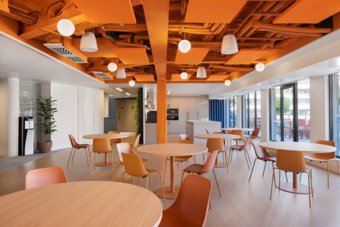
In this space, a gaming area has been combined with an imposing ping pong table customised with the orange colour of the logo. The dining area features a fully equipped kitchen with a generous central island and round tables to facilitate interaction and circulation. Finally, a landscaped terrace was designed for a variety of uses.
The chromatic unity of all areas of the lounge – office area has been enhanced by the corporate orange on the ceiling.
Design: NT Studio
Photography: Elton Rocha
Via

