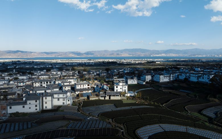
Mountain, Lake, and Ruins – The ancient villages in Dali, located on the west coast of Erhai Lake under Cangshan Mountain, offer a nurturing and pleasant living environment. Cangshan Mountain’s nineteen peaks align in a north-south direction, with eighteen streams running from west to east, nourishing the fertile plains on the west side of Erhai Lake. Traditional houses in this area typically face east, taking advantage of the morning sun and protection from the southwest winds in winter. The inner courtyards further shield residents from harsh weather, creating a traditional and natural lifestyle deeply connected to the surrounding landscape. The studio, located in the southwest corner of a village at the base of Cangshan Mountain, was built to harmonize work and life with nature.
Initially surrounded by modern concrete houses, the site featured an abandoned stone-wood courtyard with an intriguing sense of ruins, overgrown with tall weeds. Inside was a well-preserved traditional stone-wood house from the 1980s and a brick-concrete structure from the 1990s. The south building, once a traditional house, had collapsed into ruins, framing a view of the Cangshan Mountains. Thus, the originally entirely inward-looking house presents a coexisting feeling of an “inward-looking courtyard” and “outward-looking mountain landscape.” These feelings soon led to a core question of the site strategy: how to establish a new connection between the inward-looking courtyard and the large-scale mountains and fields landscape.
On-site Body-Response as a Renovation Strategy – With an eight-month deadline to move to a new studio before the old one’s lease ended, we abandoned the usual workflow. We adopted an on-site approach, commuting daily to the construction site and combining design with demolition and renovation. During demolition, we constantly visit the site to feel and learn from the site and continue refining the design. The design process for the new studio was influenced by the site’s ruins and functional considerations. The challenge was the optimal use of the small-scale space, addressing lighting issues, creating an open office environment, and accommodating various architectural studio functions. The construction team began demolition while design ideas evolved during the process. Due to time constraints, the initial focus was renovating the main stone house and north building in two phases. The first phase was completed in July 2021, allowing the move to the unfinished courtyard. The second phase refined the garden, bridge, and courtyard design, emphasizing the immersive “on-site working” experience.
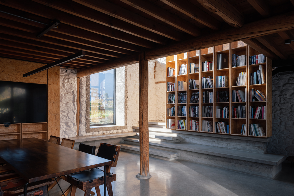
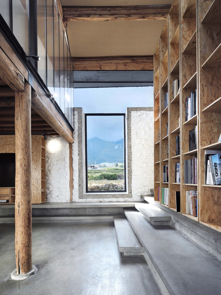
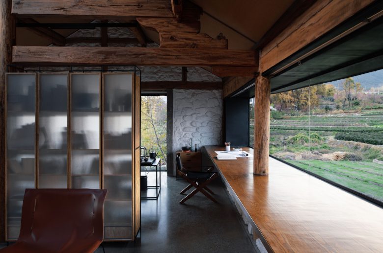
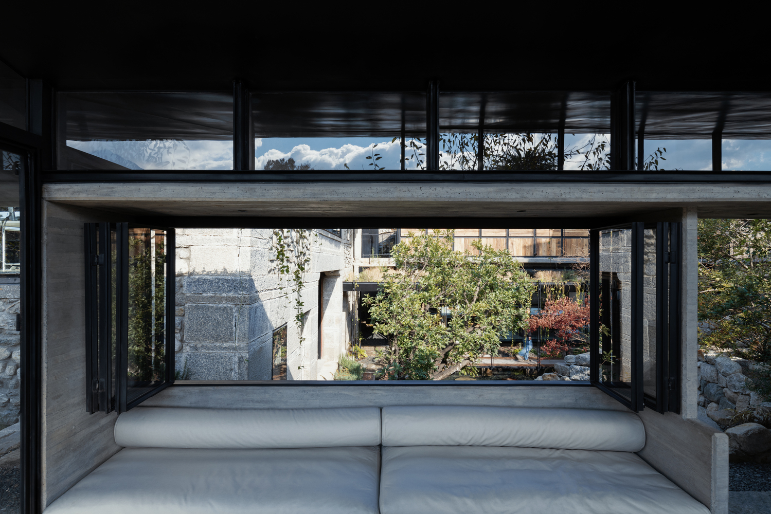
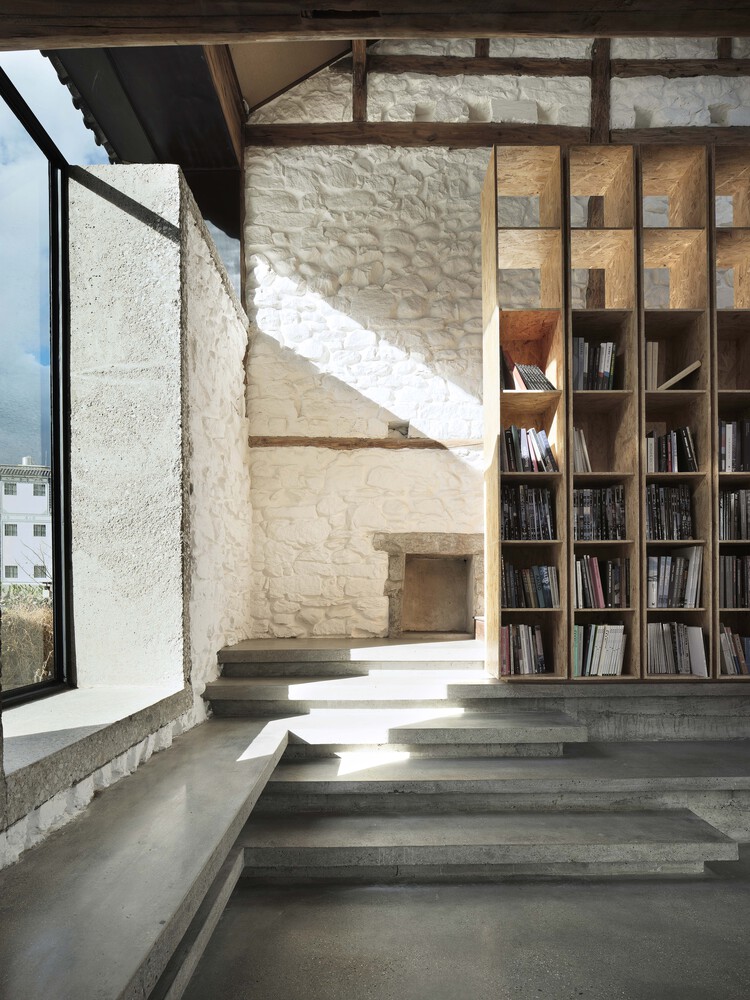
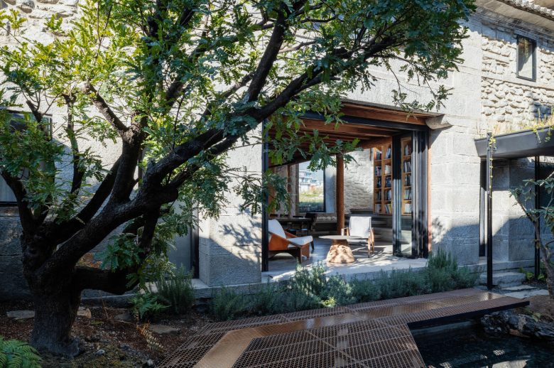
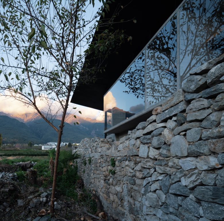
Stone House – Opening to Connect with the Mountain Landscape – The stone house features immaculate walls and well-preserved wooden structures, creating a warm and timeless ambiance. The studio’s essential functions, including a public meeting room, library, kitchen, dining area, and private workspace, are strategically distributed across its two floors, maximizing its historical charm and functionality. The design strategy for the stone house aimed to establish a strong connection with Cangshan Mountain through ‘opening’ as the primary approach. This involved creating a T-shaped opening on the west facade to enhance interior comfort and natural lighting. The vertical window, aligned with the high-level library, offers a majestic Northern Song dynasty-like view of Cangshan, harmonizing with the bookshelves and space dynamics. Meanwhile, the ribbon window on the second floor, following the old house’s eaves, frames the terraced fields when standing but reveals Cangshan’s nineteen peaks like a horizontal scroll when seated, evoking the essence of traditional Chinese landscape paintings – ‘high and distant’ and ‘horizontal and distant.’ In Dali, old masons took great pride in their stone craftsmanship, focusing on flat, square chiseled cornerstones, chamfering stones, and terrace stones. Mud masonry walls typically featured ‘straw mortar’ and Bai patterns. Wide openings were introduced to revamp a vernacular house, disrupting the original facade.
Thus, all “cultural information” was removed, revealing the stones hidden behind the straw mortar. This transformation stripped the White Clan’s earthen storehouse of its age-specific details, creating a simpler and more ancient “stone house” that celebrated the intrinsic beauty of the stone material itself. A concrete window frame was added around the new opening to reinforce the stone wall, and a coarse texture similar to the rough stone wall served as a base for steel window frames. The concrete frame was intentionally polished to match the rough stone wall. The steel window glass was seamlessly aligned with the stone wall’s outer surface, creating a tactile and visual contrast. This interplay between rough stone and smooth glass reduced the traditional wall’s perceived weight. These openings introduced a “cave space” inside, offering an interactive and immersive “cave experience” due to the 600mm thick stone walls and the unique depth of each window. The stone house interior features a prominent double-height reading area created by removing the second-floor wooden floor. A skylight and mountain view enhance the ambiance. The corner staircase is topographical and furnished, echoing the exterior terraces and functional furniture, guiding visitors to the private meeting area on the second floor.
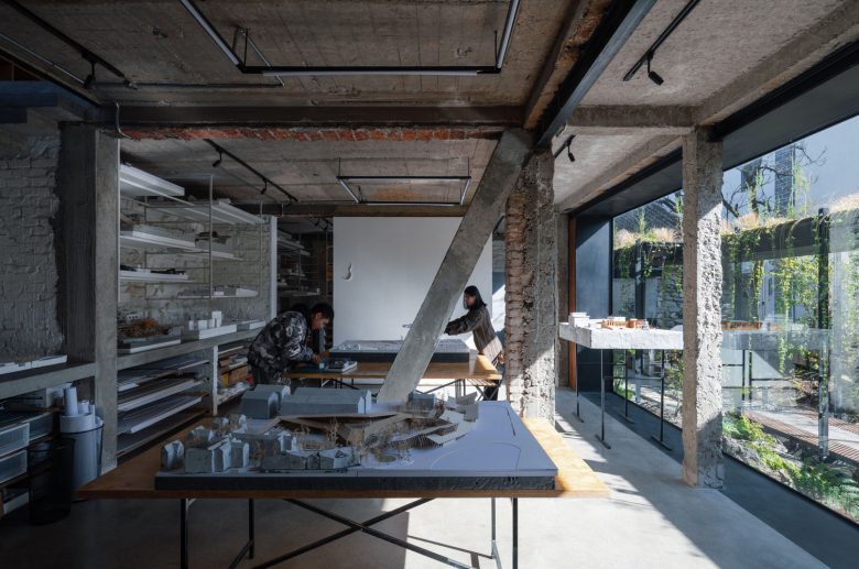
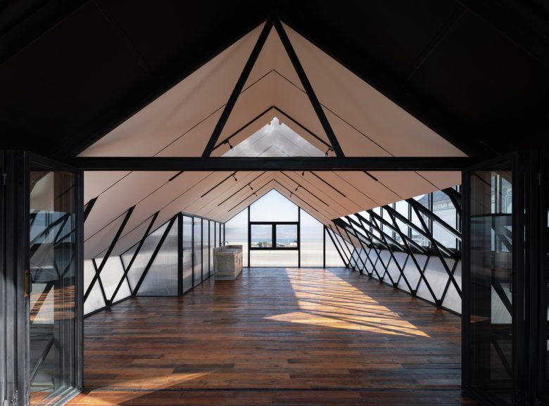
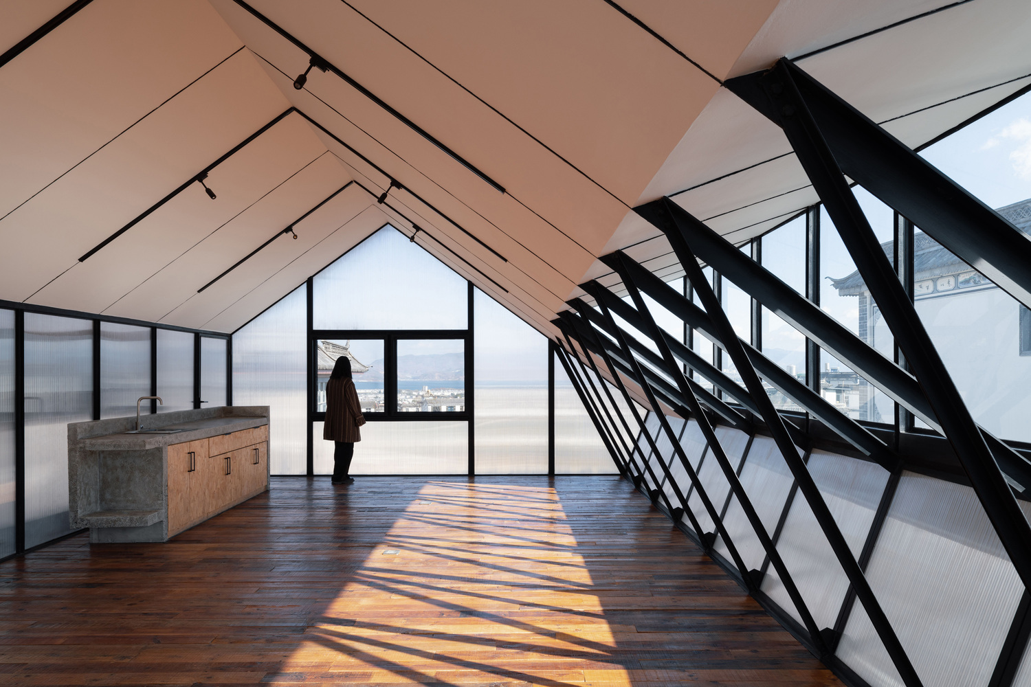
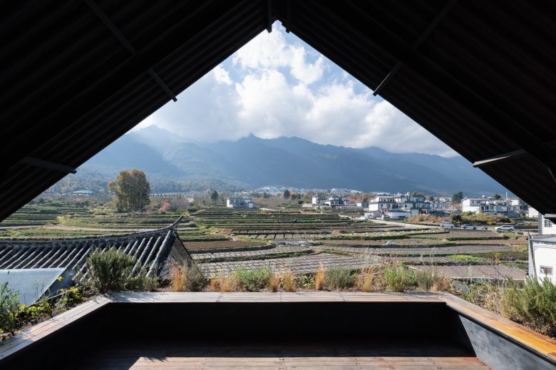
North Building – Sectional Experience Transition from Garden Cave to the Loft. The connection between the stone house and the expansive landscape relies on the facade, whereas the north building’s transformation from inward to outward is driven by its section. The first floor’s three exterior walls are solid 600mm-thick stone, with windows opening inward to the courtyard, creating a semi-underground, introverted atmosphere. The second floor, brick-concrete structure, offers better lighting and open space with long ribbon windows. The roof space on the third floor was added to provide access to views of the Cangshan Mountains and Erhai Sea, showcasing Dali’s geography. There’s no making without breaking—initial plans called for demolishing all brick walls to transform the North Building into an open office space. However, structural engineer Cai highlighted the seismic risk of a wall-less brick structure in Dali’s high seismic zone. The solution involved additional diagonal bracing columns for lateral support and horizontal reinforcing beams post-wall demolition. Extensive interior demolition and renovations were undertaken following structural recommendations and site considerations.
Three outer stone walls were preserved on the first floor, while all interior brick walls were removed, creating a semi-underground cave ambiance with concrete beams and columns.
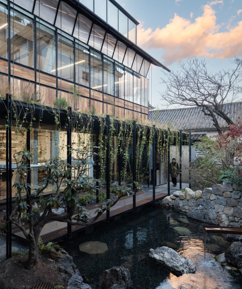
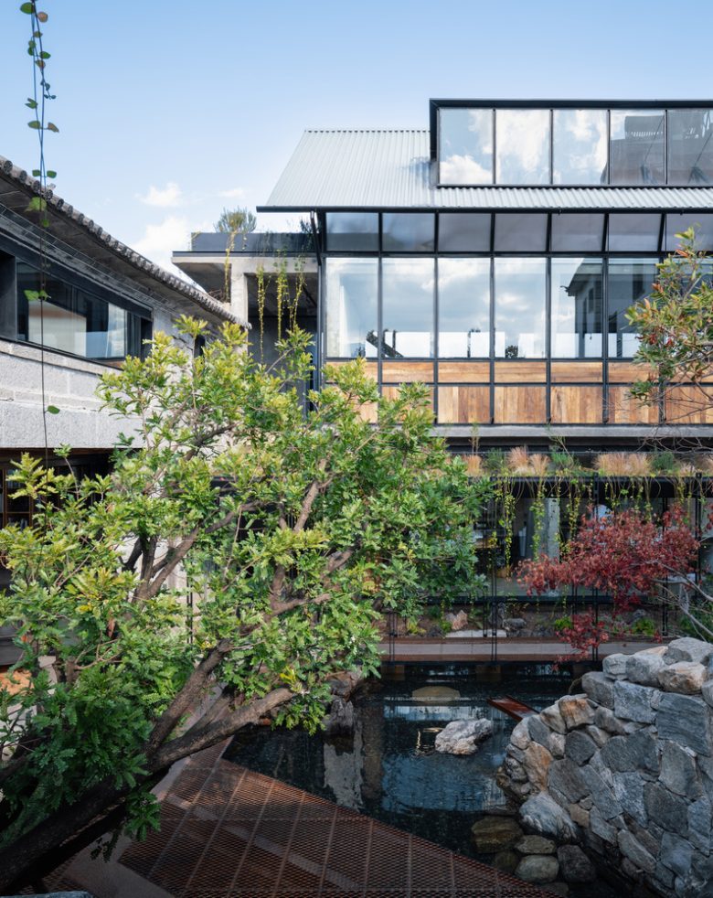
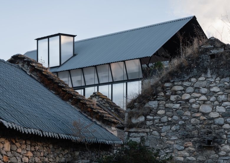
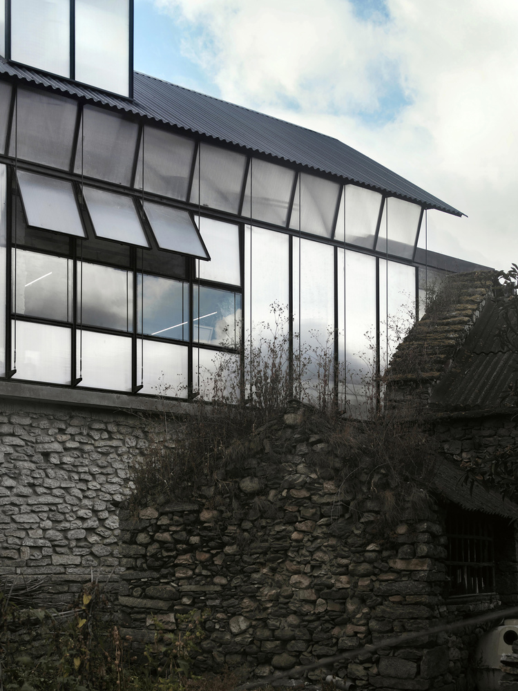
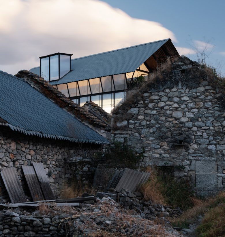
Large concealed floor-to-ceiling glass panels introduced garden views, forming a workshop space. The second floor became the main office area, with most brick walls removed and reinforced by diagonal bracing columns. Steel glazing and polycarbonate panels provided ample interior light. A light steel attic on the third floor created a public meeting space, connecting to a panoramic terrace overlooking Cangshan Mountain and offering glimpses of the Erhai Sea through a semi-transparent facade. Echoing the interior “demolition surgery,” The exterior second and third floors of the North Building together form a light and translucent steel double-slope volume, sitting on the stone wall on the first floor. It appears to be a newborn sloped roof volume, which is light, transparent, and contemporary in contrast to the surrounding old stone sloped roof context. The third floor employs one-meter spaced steel beams, matching the second-floor steel window frame spacing on the facade, reducing structural cross-section dimensions. This reduction extends to the third-floor steel diagonal bracing columns, now resembling window frames, creating a unified, lightweight, slender steel facade for the second and third floors. Given Dali’s strong winter winds, additional φ20 round steel tie rods were added outside the two and three-story facade, reinforcing the lateral wind resistance and enhancing the overall sense of lightness in the building’s design.Transforming Ruins to Gardens – From Isolated Buildings to Intertwining Locus – After renovating the stone house and north building, we moved into the new studio the following year. The natural environment excited us, but the incomplete area highlighted spatial issues. Initial ‘garden clues’ were delayed by renovation but reactivated due to daily inconveniences from the courtyard. The stone house and north building appear disjointed due to different construction systems, necessitating a reduction in the prominence of the single building and an enhancement of the courtyard’s overall experience. Secondly, there is an imbalance in the scale. The comfortable architectural scale corresponding to the traditional Bai courtyard is the gable height of one and a half stories of the old house, while the high facade of the north building and the neighbor houses on the east have formed a strong sense of oppression on the inner courtyard. The courtyard space feels abrupt and unfinished, lacking the envisioned natural life. To address these issues, the design’s second phase prioritizes a “garden strategy,” aiming to transform the site into a more cohesive and inviting environment.
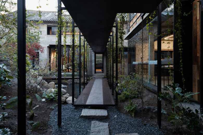
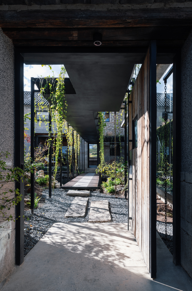
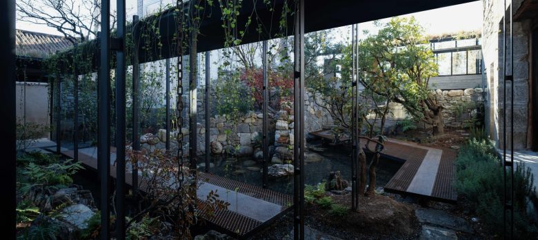
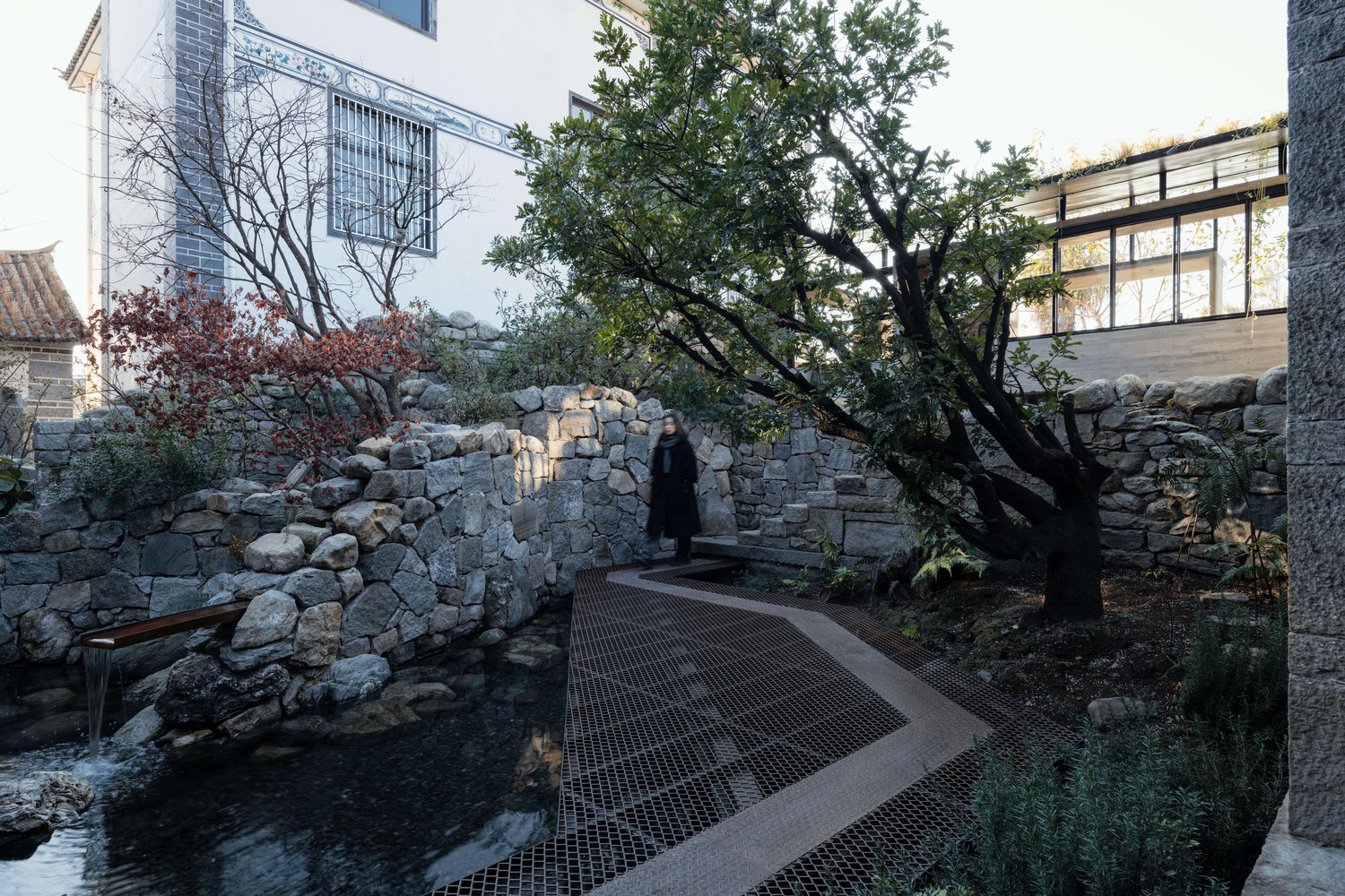
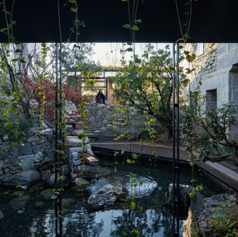
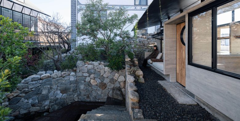
The site’s ruins were pivotal in the design, creating two distinct courtyard spaces: the “inward-looking courtyard” beneath the ruins and the “outward-looking platform” above them. Utilizing the height difference, the ruins were extended northward, forming a layered “rocky hill” with plants that relieved the pressure from the neighboring building and directed attention to the mountains and plants. The site’s half-collapsed stone wall, adorned with weeds and moss, represented the passage of time, while Cangshan stones were used in their original state to preserve the authentic Cangshan style. Capitalizing on the rich underground water at Cangshan Mountain’s base, a deep pool was integrated beneath the wall, complemented by a central courtyard well. Earth excavated was used to fill the ruins. With the garden’s topographical structure established, further elements could be introduced.Connecting Corridors as Bridges – Body Perception and Scale Reconciliation in Garden Touring. The “corridor bridge” serves as a connecting element between the courtyard gate and the stone house entrance. As a “corridor,” it strategically blocks the immediate view of surrounding tall buildings upon entering the gate. This diversion of attention towards plants and rocks near the gate reduces the sense of building oppression. Additionally, the corridor prevents a full view of the north building and the stone house, mitigating their isolation and encouraging people to engage with the garden. Steel columns guide one’s gaze towards the stone house’s entrance and the distant mountain vistas through vertical view windows. The bridge over the water emphasizes transparency and lightness with two 60mm-wide, 10mm-thick flat steel lattice columns, creating a thin and transparent appearance.
Supported by cantilevered flat steel lattice beams from concrete column bases, metal tensile nets allow people on the bridge to see the water below, creating a “sense of danger” of floating on water. This journey begins with a vestibule amid dense vegetation and leads to the revelation of the central courtyard on the left and a reflective glass facade on the right, initiating a garden tour. At the end of the corridor bridge, old stone slabs guide visitors in three directions: the west leads to the stone house, the north to the north building foyer, and the south enters the garden tour. A leaning, fragrant tree provides shade for a peaceful corner with flowing water, trees, and stone walls. On sunny days, the stone house’s first-floor folding doors open, integrating indoor and garden spaces. Climbing stone steps to the ruins transition the inward-looking garden tour to an outward-looking landscape experience.
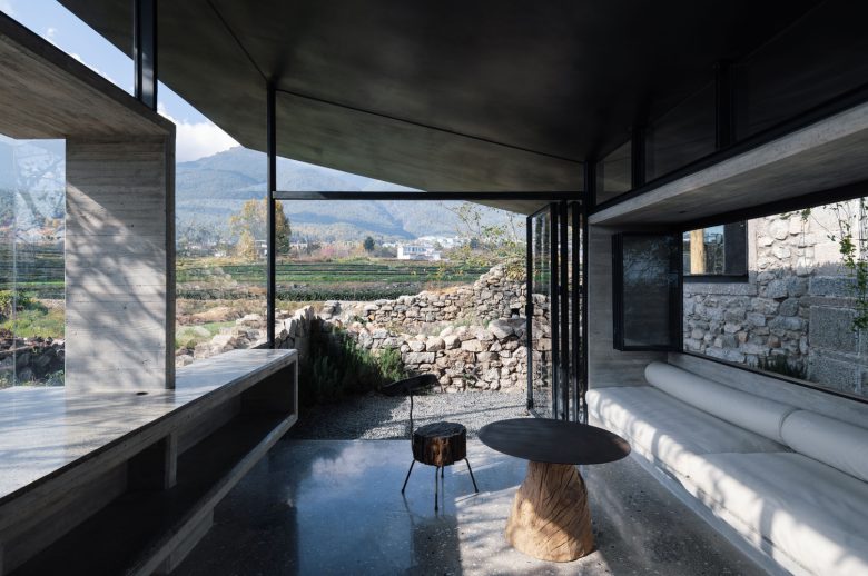
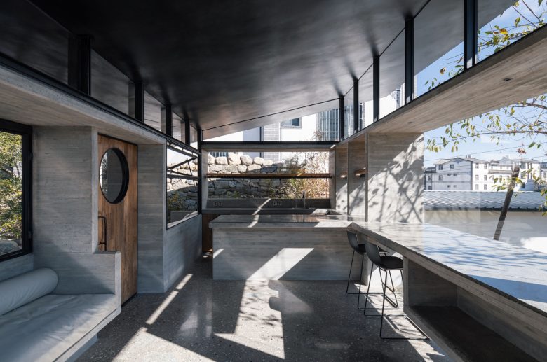
Ruins Garden Cafe – Scale converter between inner courtyard and distant mountains. The high platform offers a unique perspective, allowing simultaneous views of the inner courtyard and mountains. The Ruin Garden Café was constructed here, connecting the courtyard and distant mountains. The café’s single-slope roof is 2 meters high, facing the courtyard, creating an intimate atmosphere, while the side facing the mountains features raised eaves, providing expansive views. The slope also considers Dali’s sunlight, rising in winter to welcome warmth and lowering in summer for shade. The café pavilion was designed as a lightweight structure emerging from the site’s ruins. The lower section features concrete plinths, resembling oversized furniture, serving as a metaphor for the original ruins. These plinths offer various interactions with the body, including a 1950mm-high entrance, cozy seating areas under the north eaves, and a cafe bar extending to a mountain view bar. All concrete elements, including walls, roofs, and countertops, are 80mm thick with 45-degree beveled chamfers at the corners, lending a furniture-like scale and ambiance to the structure. The café pavilion’s upper section features a thin, counter-ribbed steel roof made of fully welded 6mm-thick steel plates, supported by channel steel and short columns welded to the concrete plate. The delicate operation of these constructions ultimately leads to the body’s unfamiliarity, and every guest entering the cafe wonders how such a thin and light roof is supported.
Ruins Cave as a garden – The garden tour finally ends in the moment of gazing at the mountains or looking back at the courtyard in the Ruins Garden Café. The isolated architectural experience is finally rewoven into a holistic experience through the movements of the body, such as walking, stopping, gazing, climbing the steps, peering into the distance, looking back, etc., as well as the blurred boundaries between the interior and the gardens that are interpenetrating and intertwining. Young architects often struggle to design spaces that personally resonate due to the challenge of integrating professional views with real-life experience. Achieving personal comfort in design fosters empathy, helping them create spaces that comfort others. In the Yunnan dialect, “comfortable” is “Haozai,” implying architecture should function and nurture its inhabitants. The studio’s formal name, “Ruins Cave Garden,” encapsulates its essence. “Ruins” reflects the site’s stone ruins, the starting point. “Cave” signifies the cave-like interior experience with thick stone walls. It is also the primitive tactile sensation of the body interacting with the structure, hole, or wall in this ” Close to hand combat ” design. “Garden” symbolizes a spatial strategy merging interior and exterior experiences, mirroring the natural lifestyle inspired by years in Dali.
Architects: ArCONNECT Architects
Lead Architect: Wu Zhou
Concrete Consultant: Suzao Architects
Landscape Design: Liu Ju, Wu Zhou
Structural Design: Cai Yanming
Design Team: Chen Nuo, Ye Xinmiao, Cai Huangyi, Liu Changrui, Bai Haowen, Tang Zhiting, Hu Jiaqi, Chen Yunxiang, Sun Yiqi, Zhou Chunxiang, Mu Ziqi, Chen Ziyao, Zhang Huaxin, Deng Yunrui, Chen Xiaoyong, Wang Huiyan
Resident Architect: Chen Nuo, Ye Xinmiao
Photographs: Hao Chen, Pengfei Wang
Via













20,866 thoughts on “Ruins Cave Garden by ArCONNECT Architects”